Maybank:
Inspire Good SG
Maybank:
Inspire Good SG
Celebrating Good Deeds
Celebrating Good Deeds
Led the visual design across the campaign, from the signature card to its digital and social applications.
Client
EPG GROUP
PROJECT SCOPE
BRAND STRATEGY
VISUAL IDENTITY
DESIGN SYSTEM
WEBSITE DESIGN UI/UX
Year
2024 - 2025
Role
LEAD BRAND
& UI/UX DESIGNER
RECOGNITION
🏆 Markies Awards Singapore · DUAL Finalist
Most Creative: Digital & Most Effective Use: Experiential
🏆 Shorty Awards · Nominee
Multi-Platform Campaign
Bringing a community-focused campaign to life across physical, digital, and social experience.
Bringing a community-focused campaign to life across physical, digital, and social experience.
Client
Maybank singapore
PROJECT SCOPE
art direction · branding · illustration · social media
BRAND STRATEGY VISUAL IDENTITY DESIGN SYSTEM UI/UX
RECOGNITION
🏆 Markies Awards Singapore · DUAL Finalist
Most Creative: Digital & Most Effective Use: Experiential
🏆 Shorty Awards · Nominee
Multi-Platform Campaign
Year
2020
Role
Lead Designer
RECOGNITION
🏆 Markies Awards Singapore · DUAL Finalist
Most Creative: Digital & Most Effective Use: Experiential
🏆 Shorty Awards · Nominee
Multi-Platform Campaign


introduction
#InspireGoodSG was a social initiative created for Maybank Singapore to strengthen awareness of its Brand Purpose through meaningful community engagement.
At the time, Maybank aimed to increase Brand Consideration from 4.8% to 6%, while finding a more engaging way to connect with the Singaporean community.
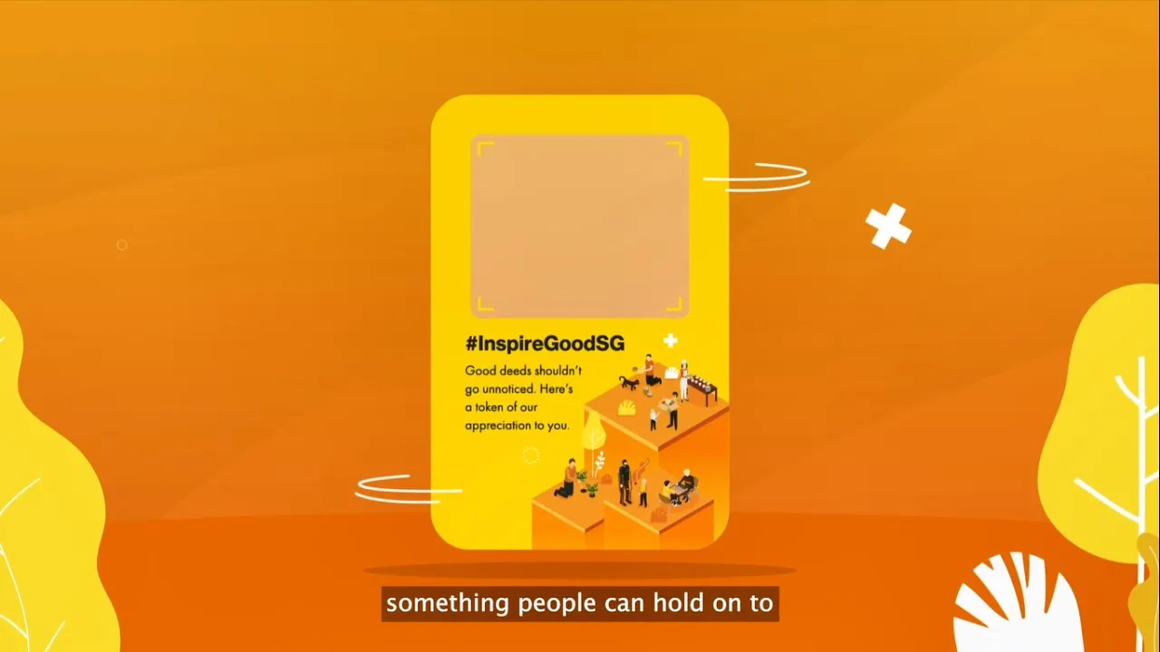
I led the visual design across the campaign, with the #InspireGoodSG card at the centre of the experience.
brand purpose
To humanise financial services by building meaningful connections through community engagement and encouraging people to do good.
introduction
#InspireGoodSG was a social initiative created for Maybank Singapore to strengthen awareness of its Brand Purpose through meaningful community engagement.
At the time, Maybank aimed to increase Brand Consideration from 4.8% to 6%, while finding a more engaging way to connect with the Singaporean community.
I led the visual design across the campaign, with the #InspireGoodSG card at the centre of the experience.
brand purpose
To humanise financial services by building meaningful connections through community engagement and encouraging people to do good.
introduction
#InspireGoodSG was a social initiative created for Maybank Singapore to strengthen awareness of its Brand Purpose through meaningful community engagement.
At the time, Maybank aimed to increase Brand Consideration from 4.8% to 6%, while finding a more engaging way to connect with the Singaporean community.
I led the visual design across the campaign, with the #InspireGoodSG card at the centre of the experience.
brand purpose
To humanise financial services by building meaningful connections through community engagement and encouraging people to do good.
introduction
#InspireGoodSG was a social initiative created for Maybank Singapore to strengthen awareness of its Brand Purpose through meaningful community engagement.
At the time, Maybank aimed to increase Brand Consideration from 4.8% to 6%, while finding a more engaging way to connect with the Singaporean community.
I led the visual design across the campaign, with the #InspireGoodSG card at the centre of the experience.
brand purpose
To humanise financial services by building meaningful connections through community engagement and encouraging people to do good.
the main idea
Inspiring a Sequential Relay of Good Acts
Inspiring a Sequential Relay of Good Acts
Inspiring a Sequential Relay of Good Acts
The campaign turned one good deed into the starting point for another, using the #InspireGoodSG card to create a continuous chain of participation.
The campaign turned one good deed into the starting point for another, using the #InspireGoodSG card to create a continuous chain of participation.

key visual
Inspire Good SG Card
Inspire Good SG Card
At the heart of the campaign was a physical card designed to make the idea tangible. I developed its visual treatment, illustration, messaging, and information hierarchy to create a recognisable campaign piece that could move between people.
At the heart of the campaign was a physical card designed to make the idea tangible. I developed its visual treatment, illustration, messaging, and information hierarchy to create a recognisable campaign piece that could move between people.
key visual
Inspire Good SG Card
At the heart of the campaign was a physical card designed to make the idea tangible. I developed its visual treatment, illustration, messaging, and information hierarchy to create a recognisable campaign piece that could move between people.


visual direction
Building the Campaign Look
The visual direction translated Maybank’s purpose of humanising financial services into a visual language that felt warm, approachable, and people-focused.
The palette builds from Maybank’s signature yellow for brand recognition, with warmer yellow and orange tones adding optimism and energy.
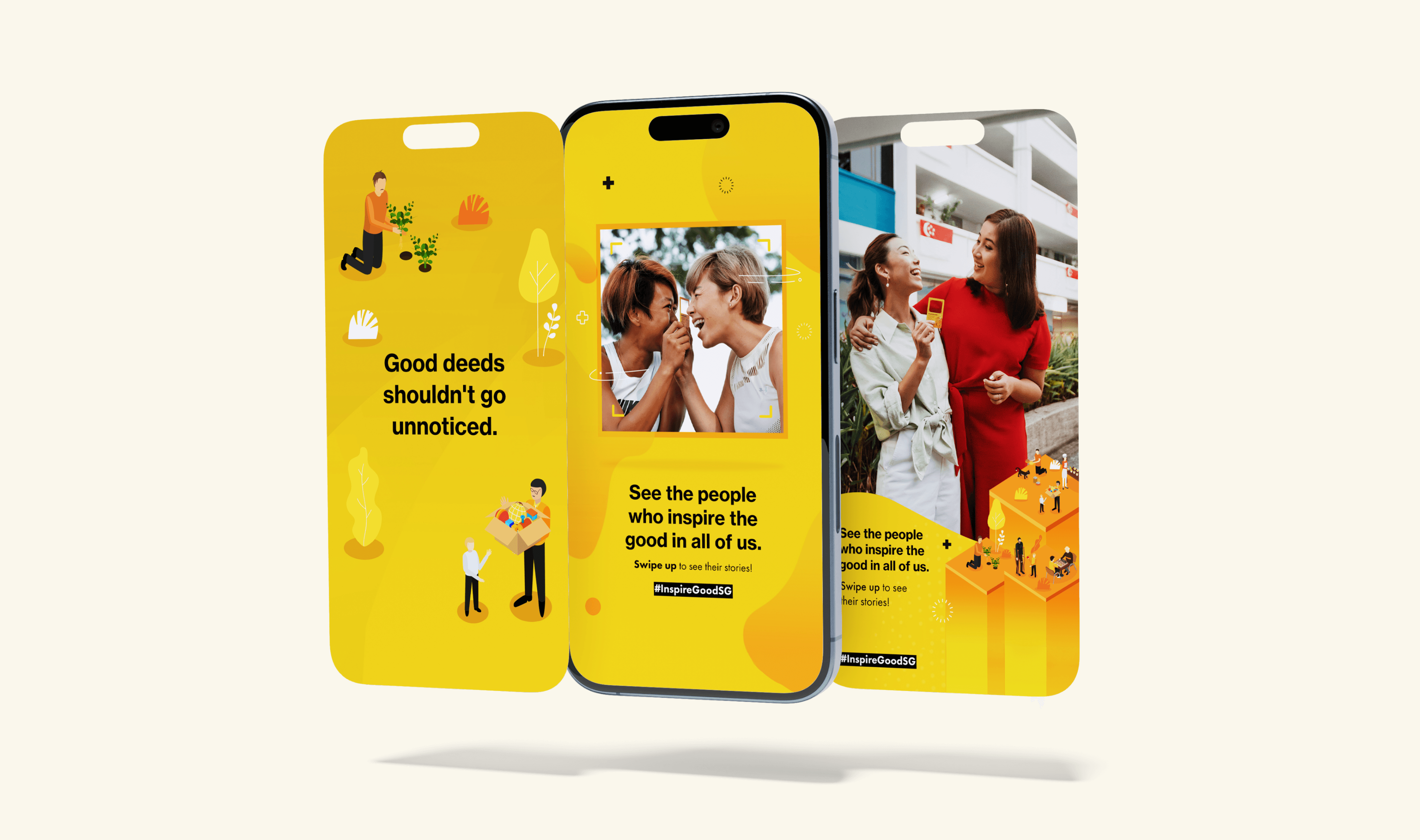
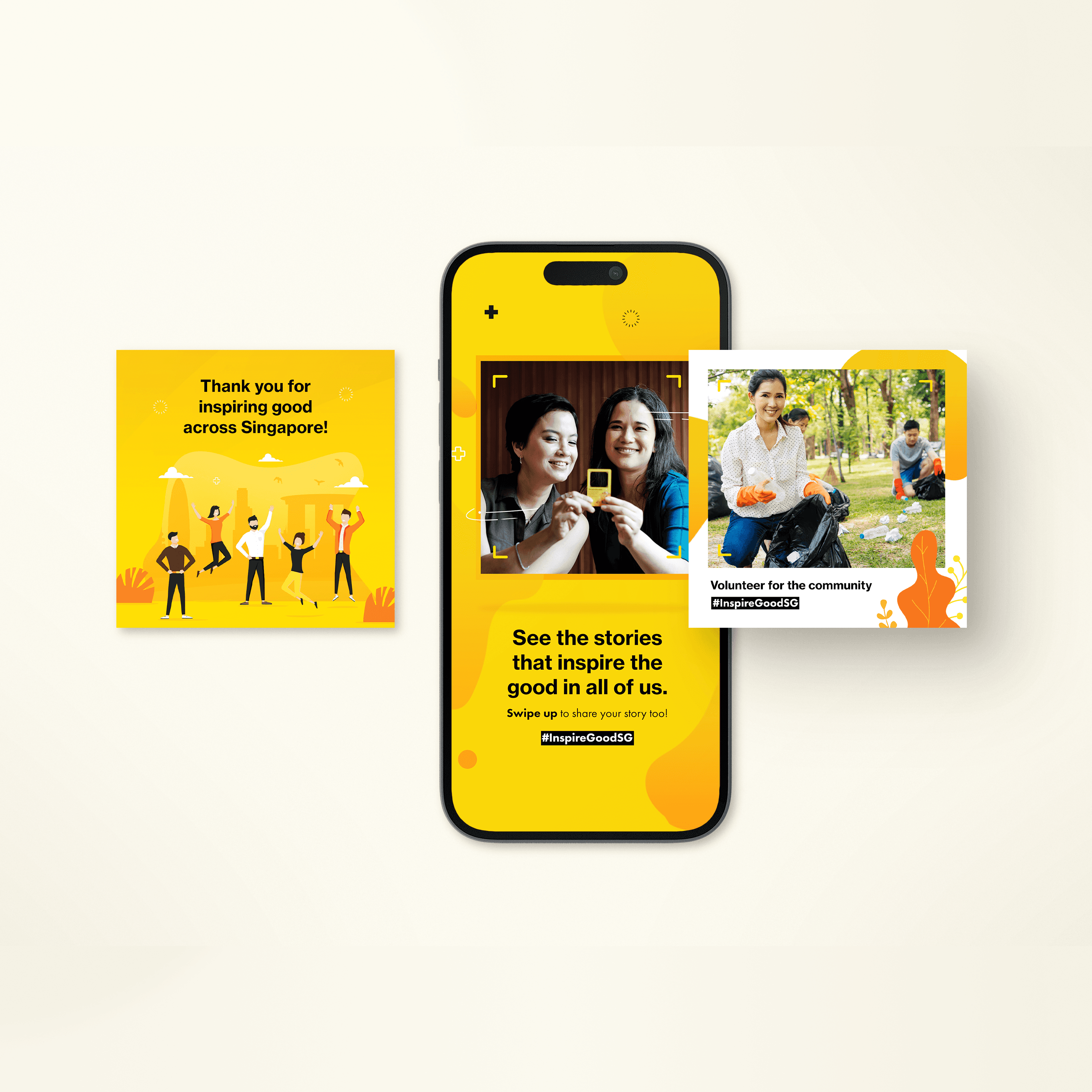
Custom illustrations of people engaging in everyday acts of kindness brought the community aspect of the campaign to life, while bold typography and simple graphic elements made the message clear and approachable across different formats.
Together, these elements helped shift the campaign away from traditional financial communication and towards something more human and community-led.
visual direction
Building the Campaign Look
The visual direction translated Maybank’s purpose of humanising financial services into a visual language that felt warm, approachable, and people-focused.
The palette builds from Maybank’s signature yellow for brand recognition, with warmer yellow and orange tones adding optimism and energy.
Custom illustrations of people engaging in everyday acts of kindness brought the community aspect of the campaign to life, while bold typography and simple graphic elements made the message clear and approachable across different formats.
Together, these elements helped shift the campaign away from traditional financial communication and towards something more human and community-led.
visual direction
Building the Campaign Look
Building the Campaign Look
The visual direction translated Maybank’s purpose of humanising financial services into a visual language that felt warm, approachable, and people-focused.
The visual direction translated Maybank’s purpose of humanising financial services into a visual language that felt warm, approachable, and people-focused.
The palette builds from Maybank’s signature yellow for brand recognition, with warmer yellow and orange tones adding optimism and energy.
Custom illustrations of people engaging in everyday acts of kindness brought the community aspect of the campaign to life, while bold typography and simple graphic elements made the message clear and approachable across different formats.
Together, these elements helped shift the campaign away from traditional financial communication and towards something more human and community-led.
The palette builds from Maybank’s signature yellow for brand recognition, with warmer yellow and orange tones adding optimism and energy.
Custom illustrations of people engaging in everyday acts of kindness brought the community aspect of the campaign to life, while bold typography and simple graphic elements made the message clear and approachable across different formats.
Together, these elements helped shift the campaign away from traditional financial communication and towards something more human and community-led.
Many LGBTQIA+ people still struggle to find spaces where meaningful relationships can develop across generations.


OUTCOME & IMPACT
A little good went a long way
A little good went a long way
The campaign helped turn Maybank's brand purpose into an active community experience, contributing to its goal of strengthening Brand Consideration and generating meaningful participation.
The campaign helped turn Maybank's brand purpose into an active community experience, contributing to its goal of strengthening Brand Consideration and generating meaningful participation.
OUTCOME & IMPACT
A little good went a long way
The campaign helped turn Maybank's brand purpose into an active community experience, contributing to its goal of strengthening Brand Consideration and generating meaningful participation.
241K
Social media reach
Social media reach
2M+
Video impressions
Video impressions
2.6K+
Participants
$759K
PR value
3
Charity partners
2.8×
Average number of times each card was passed on
2.6K+
Participants
Participants
$759K
PR value
PR value
3
Charity partners
Charity partners
2.8×
Average number of times each card was passed on
Average number of times each card was passed on
241K
Social media reach
2M+
Video impressions
2.6K+
Participants
$759K
PR value
3
Charity partners
2.8×
Average number of times each card was passed on
2.6K+
Participants
$759K
PR value
3
Charity partners
2.8×
Average number of times each card was passed on